

Camitz M.. StatFlu - a static modelling tool for pandemic influenza hospital load for decision makers. Euro Surveill. 2009;14(26):pii=19256.
Introduction
Many successful models using dynamic simulations to estimate the effect of an influenza pandemic have been presented and have been essential in providing the knowledge needed for pandemic preparedness [1-9]. All models have their inherent ailments and there is always a great deal of uncertainty in the estimates they are able to produce. This depends on the data used to calibrate the model as well as the assumptions made by the model itself. The virulence of a new viral strain can only be guessed at. Contact patterns and other social dynamics contribute a similar uncertainty. Conveying the difficulties of modelling and the effect of the many uncertainties in the estimates provided should be a primary objective for modellers.
From the attack rate estimates that dynamic models produce it is possible to estimate the hospital load, using assumptions of how many of the clinically ill are expected to seek medical care. This could be done by extrapolation from historic data on past epidemics or pandemics. It is this last step that is the focus of many static models.
Many publicly available software applications use static modelling. Whether using simulation output or presumed attack rate scenarios, these models translate outbreak data into variables of interest, such as hospital load, cost of treatment or loss of lives. Static models have the advantage that assumptions about social networks and similar factors are already implicit in the data, which makes them very reliable. Generally, fewer assumptions are made which need to be accounted for and the results are more transparent. The two main sources of uncertainty in static models are in the parameters of the extrapolation and in how historic data from a particular region and time is relevant and plausible in another region and another time. The first of these uncertainties can be handled using statistical methods. All models described in this paper have this in common.
A notable example of a static modelling approach available on the internet is FluSurge [10], released by the United States (US) Centers for Disease Control and Prevention (CDC), which can be used to project the total hospital load over the duration of the pandemic. This software, its predecessor without time projection – FluAid [11], as well as slightly adapted versions thereof, have been used by authors in published articles predicting hospital load in several regions and countries [12-17].
The StatFlu project was initiated to bridge the gap between researcher and decision maker and to replace FluSurge, amending several of its flaws, to be detailed below. StatFlu is currently in use at the National Board of Health and Welfare in Sweden. The excess hospital and primary care load due to a pandemic is calculated without intermediate steps using a closed formula, at a resolution of one day. The full variance of the possible scenarios generated by the uncertainties in the input is displayed using a colour gradient in the plots. We have built our model with a bottom-up approach, incorporating the time-distribution from the start. We also allow the user to specify the age-dependent risk of contracting infection, relative to the other age groups, rather than a distribution of the attack rate among age groups, making the model independent of differences in age distribution.
Using StatFlu, the user can immediately see the effects that changing assumptions in attack rate, average susceptibility of age groups, duration of the pandemic and length of hospital stay will have on the hospital load and primary care visit frequency. The uncertainties of other parameters in the model, in particular the risk of hospitalisation of infected individuals, are taken into account by use of a Monte Carlo-type sensitivity analysis [18-20]. The output estimates of 10,000 such simulations are collected and presented so that probable and less probable outcomes are apparent. The objective is for the user to acquire an intuitive understanding for the assumptions behind the estimates.
StatFlu can be downloaded and used freely from www.s-gem.se/statflu.
Previous research
Meltzer et al. used Monte Carlo methods to express the uncertainty in a study to evaluate the economic impact of a pandemic influenza outbreak in the US [21]. Using predefined probability distributions they could model a range of estimates. Essential parameters for age group-specific attack rates were collected from various studies of outbreaks of seasonal and pandemic influenza. Parameters were assumed to be either triangular or uniform in their uncertainty distributions. The distributions were randomly sampled and used to calculate mean economic impact. Mean hospital admittance and mortality was calculated with 90% confidence bounds. They also compared results with and without the use of vaccination.
A similar setup was used in France by Doyle et al. with slightly different background variables and with a focus on hospital admittance and mortality [22]. Many parameters were taken from the study by Meltzer et al. Also in this study the authors compared scenarios with and without the use of intervention programmes, in this case both vaccination and antiviral pharmaceuticals.
Van Genugten et al. used detailed national data collected from seasonal influenzas [23]. Their approach was a scenario analysis. This approach is more pedagogical and the results are more readily applicable. The lack of sensitivity analysis means that only the expected outcome is shown of each scenario. Information on the variability of the output is not provided. This may or may not be problematic depending on the parameter values used.
A missing piece in the first two studies mentioned above is how the hospital load varies over time. It is important to point out that the predicted increase in patient load during a pandemic, whatever the degree of uncertainty, will not happen in one day. The frequency of visits will follow the epidemic incidence curve, which means that the estimated total increase cannot directly be translated into a required capacity.
Reasonable adjustments have been made to amend this. Bonmarin et al. [24] published a follow-up calculation to the French study, assuming the shape of the time function would be similar to that of previous seasonal influenza outbreaks as gathered from sentinel data. Van Genugten et al. included a time plot in the original study where the estimated attack rate was distributed along a Gaussian (normal) curve [23]. FluSurge also plots the output on a time axis, although it is not clear what the rationale behind their choice of algorithm is.
In the Results section of this paper, we compare output from StatFlu and FluSurge. In our opinion, the latter is flawed. We are concerned about the appearance of the admissions plot as well as some of the calculations concerning the death rate described in the manual [25]. Most importantly, however, FluSurge will give unexpected results unless the age group proportions in the target country or region matches those of the United States. Both Doyle et al. [22] and van Genugten et al. [23] have used data from Meltzer et al. without the flaw.
It should also be noted that the contribution of static models to understanding the effect of vaccination and antiviral pharmaceuticals is questionable. Usually, the effectiveness of the drug is quoted and used simply as a reduction factor on final outcome [21-23]. However, as with any intervention strategy, antiviral drugs (as prophylaxis or therapy) as well as vaccination, can at best completely halt the spread, but may also have an insignificant impact. The end result is in part due to chance, but more specifically, each prevented case will not spread the disease further and one dose can have a wide-reaching effect in the transmission chain. At the very least a pharmaceutical effect should be used, covering both the effectiveness of the drug and the dynamic effects. Due to the difficulty in this, we decided not to include the feature in the currently available release of StatFlu. However, users should be cautioned against the assumption that antiviral drugs and vaccines are not effective.
Both Meltzer et al. and Doyle et al. provide estimates of incidence reduction following either vaccination or antiviral drugs. Wallinga et al. [26] have developed the model by van Genugten et al. with a dynamic model approach, further developed by Mylius et al. [27].
Aims of the StatFlu project
Our priorities in developing StatFlu were:
1. Pedagogical input and output,
2. Full time resolution,
3. Transparency,
4. Visualised variance/uncertainty combined with scenarios analysis,
5. Independence from age distribution.
In our opinion, this work represents an improvement over previous attempts in terms of presentation and, in some aspects, of validity. It should be pointed out that the outcome is still highly uncertain and the intention with StatFlu is to highlight the uncertainty, not conceal it. There is still a danger that the user over-interprets the results. StatFlu is a tool for aiding intelligent decision-making, and the results must always be interpreted by the user based on input and experience.
In a recent version of the model an addition was made to provide figures for primary care load whereby we also explored the possibility of a decrease in load due to public awareness of transmission risk within the health care system. We call this the fear factor. Studies conducted during the epidemic of severe acute respiratory syndrome (SARS) support such assumptions [28,29]. A reduction in visits as large as 35% was seen in Taiwan during following the peak of the epidemic.
Methods
A detailed description of the model is given in a separate section at the end of the article.
Data and input
As much of the required epidemiological data is not available in Sweden, as far as we know, we have incorporated many of the figures found in Meltzer et al. [21], and references therein, into StatFlu, as we regarded this paper to be the standard in the field [30-34]. Results can therefore be compared with that of other studies based on the same parameters, differences resulting primarily from differences in demographics and less from differences in epidemiological assumptions. A summary of the variables used in StatFlu is given in Table 1.
Regarding the size of the risk groups in Sweden, we used the Swedish Hospital Discharge Diagnosis Register [35] for a rough estimate of the prevalence of certain chronic diseases including heart, kidney and lung disease that increase the risk of developing complications and being hospitalised subsequent to an influenza infection. These data are stratified by age, county and the number of distinct diagnoses. Our results may be considered low compared to estimates in other countries.
In the estimation of the number of primary care visits we used data from the Swedish Hospital Discharge Diagnosis Register on influenza diagnosis in each county during a normal influenza season. We also included estimates on the total primary care visits, taken from Otterblad Olausson [36].
Estimates from Meltzer et al. used in our model included the risk of being hospitalised and visiting primary care depending on age group and risk group. We use the estimated lower and upper bounds including the conversion factor used to convert from population risk to risk among afflicted [21].
The users themselves enter the population size and demographics by selecting one of the predefined counties or the whole country. It is also possible to customize the demographics with data from other countries or regions by editing a text file. The user also sets the duration of the pandemic, the average duration of a hospital visit, the fear factor, and, as discussed in the introduction, the age group-dependent relative risk of infection. The user has at their disposal a flexible graphical user interface functional under the Windows operating system.
Table 1 shows the input variables used in the model, the details of which are described below in the Model section.
Table 1. Variables used in StatFlu, their sources and implementation

Results
Output of StatFlu and comparison with FluSurge
We provide here (Figure 1) sample outputs from StatFlu based on the whole Swedish population, using Swedish values for risk group distribution as described above, an attack rate of 25%, a duration of 90 days of the epidemic, and 10 days average time in hospital (full colour figures are available from the StatFlu website, www.s-gem.se/statflu). We also used the values from Meltzer et al. for age group-dependent relative risk of infection [21]. The most probable scenario estimates the number of simultaneously occupied beds to about 7,500 at the peak of the outbreak, at 28 days.
Figure 1. Example of hospital load output from StatFlu, i.e. simultaneously occupied hospital beds

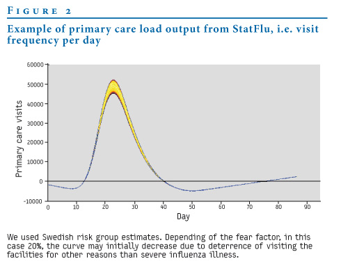
Figure 2 shows the primary care visit load, i.e. the number of visitors per day. We set the fear factor to 20%, resulting in an initial decrease in the patient rate. 23 days into the outbreak, the increased rate of patients is just short of 50,000 in the most probable scenario.
Figure 2. Example of primary care load output from StatFlu, i.e. visit frequency per day
For comparison with FluSurge we chose the same settings between the two applications as far as was possible. This included population size, attack rate, hospital visit duration and duration of pandemic. In StatFlu, we used values from Meltzer et al. for age group-dependent relative risk of infection [21]. We also used the risk group partition from Meltzer et al. In FluSurge we set the probability for intensive care unit and ventilator requirements to =0, because the types of care are not differentiated in the current version of StatFlu. The results are slightly higher than in the previous scenarios modelled for Sweden, probably due to the size of the risk groups (see Discussion).
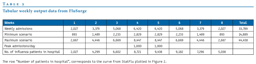
Table 2 shows the weekly admission rate as modelled in FluSurge. The last row shows the number of patients in hospital, and these values can be compared to the plotted output from StatFlu in Figure 2.
Table 2. Tabular weekly output data from FluSurge
The two applications give similar estimates, as is to be expected in this comparison scenario. The daily distribution of admissions given by FluSurge is the interpolated curve in Figure 3.
Figure 3. Hospital load in comparison scenario from StatFlu, to be compared to the output from FluSurge in Table 2

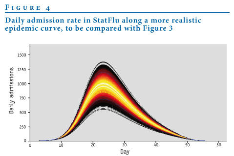
Figure 4 shows the corresponding plot from StatFlu accomplished by setting the duration of stay =1.
Figure 4. Daily admission rate in StatFlu along a more realistic epidemic curve, to be compared with Figure 3
The results provided by StatFlu represent an improvement over FluSurge in terms of graphic display of the load and the uncertainty, the daily resolution of the results and the robustness of the calculations.
Discussion
Regarding the size of the risk groups in Sweden, we used the Swedish Hospital Discharge Diagnosis Register [35] for a rough estimate of people inflicted with certain chronic diseases including heart, kidney and lung disease. Persons so diagnosed were assumed to have an increased risk of developing complications and being hospitalised subsequent to an influenza infection. We calculated that roughly 2% of the population belong to the high-risk group. This in contrast to 15% in Meltzer et al. and 10% in van Genugten et al. [21,23]. The difference has to do with limiting the number of diseases included in the query, including persons over the age of 64 years based only on the discharge data in the high-risk group and not including pregnant women, infants and institutionalised persons. Meltzer et al., for example, included by default 40% of the population above the age of 65 years.
All individuals registered at a Swedish hospital during 2006 with one or more of a predetermined set of symptoms or diseases were counted. Ultimately, our goal was to sample the entire population that had at one point in time carried such disease, i.e. the prevalence. The prevalence is generally very hard to estimate accurately without conducting a large scale study. We restricted our method to taking hospital discharge frequency to be an estimate of the prevalence. The sample period of one year was chosen arbitrarily. An extension of the sampling period would probably yield a higher number of cases but would also make it likely that a significant number is lost due to death during the sampling period.
It might be considered a flaw that we used many epidemiological parameters from an American study, as the relevant figures should reflect conditions for the nation in which they are applied. But the figures in Meltzer et al. [21] are boundary values reflecting a range of possible values. Based on these values we performed an uncertainty analysis as described above. As a benefit we have the opportunity to compare results with Meltzer et al. and all others using the same values.
Model
Occupancy
We postulated that the pandemic incidence is normally (Gaussian) distributed over time, adopted from [23]. Notation is according to .
.
This gives a symmetrical distribution with thin tails at either end. Adjusting the appearance to a more recognisable form can be accomplished by time substitution with a cubic spline, as explained below. As the incidence is normally distributed, so is the number of daily admissions. The procedure gives the curves a more recognisable form but may give false confidence in the output.
As the incidence is normally distributed, so is the number of daily admissions. We have complete control of the mean and standard deviation of this distribution. The mean m is the point in time when the pandemic is expected to reach its peak. s is the standard deviation and controls the horizontal distribution over the duration of the outbreak. A is a normalising constant. The duration of the pandemic, the average length of each hospitalisation and the risk of admission, given symptoms, are assumed independent of the attack rate. All these parameters are assumed given at the start and can be altered by the user.
The number of admissions during the period t1 till t2 is normally distributed according to
(1) 
The total admittance during the pandemic, S, is the integral taken over the whole time axis which is shown to be  .
.
The Gaussian is defined on an infinite axis in both directions, but we took the end of the epidemic te to be the point in time when the number of remaining admissions drops <1, i.e.
(2) 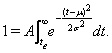
Symmetry similarly defines the start of the pandemic t0. Setting the peak of the epidemic to m = te/2 and t0=0, s?can be extracted by solving the integral.
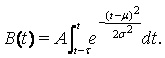
The hospital load was considered by introducing the average duration of each hospital visit into the model and calculating the number of simultaneously occupied hospital beds, the occupancy. Let t be the average duration of each hospital visit. The number of simultaneously occupied hospital beds, the occupancy B(t), is then given by
(3) 
Time substitution
The Gaussian distribution, though a good starting point and easy to manipulate mathematically, is decidedly not realistic enough with its symmetric shape. Epidemics are not symmetric. The most familiar shape is one that climbs quickly, almost exponentially, and reaches a peak before declining with a long tail. This is the shape that is generated by the standard SIR (Susceptible – Infectious – Recovered) model [41]. To accommodate the user’s expectations, we choose to manipulate the form to resemble something recognised from classical epidemic models, using a one-to-one function  on the interval [t0,te]. This function must obey
g(t0) = 0
g(te) = te
g’(t) = 1, t ≤ 0 and t > te
in order not to change the tail values. The definite solution to the integral (1) now must carry with it a correction e. We chose a piecewise continuous spline:
g(t) = t, t ≤ t0 and t ≥ te
g(t) = -2.9t3 + 1.8t2 + t, t0 < t ≤ .4te
g(t) = 1.9t3 - 1.7t2 + t +.50, .4te < t ≤ .74te
g(t) = 8.2t3 + .21t2 +.53t +.73, .74te < t ≤ .94te
g(t) = -112t3 + .5.1t2 +1.6t +.91, .94te < t ≤ te
A correction was calculated numerically for feasible integer values of te ensuring that the total number of cases remains constant. The resulting distribution is depicted in Figure 5.
Figure 5. The new incidence curve, a normal distribution with time substitution

The other definitions in the previous sections were redefined by replacing t with  .
.
The time substitution is implemented in the current release of StatFlu without the possibility to turn it off. This possibility will be an important amendment to upcoming releases, to make sure the user recognises the artificiality of this approach. Otherwise, there is a danger of too much confidence in the graph.
Monte Carlo simulation
The uncertainty in the risk of succumbing to illness upon infection and being admitted to hospital is modelled using a beta-distribution over a given uncertainty interval (see introduction). The beta-distribution was chosen for its applications in Bayesian sensitivity analyses [42], opening the possibility of creating a distribution based on point value estimates of risks from an expert panel. The intervals are specific for each combination of age group and risk group, six in total. 10,000 random values are picked from each distribution producing a value for the total admittance, S, according to equation (1). This value in turn is used to calculate according to equation (2).
It should be noted that the values from the size distributions are coupled, i.e. not considered independent. More specifically this entails that a single value is picked randomly from a uniform distribution and then transformed to each of the six beta-distributions, giving rise to six different value of risk for admission. The admittance is calculated separately and then added. The purpose of the coupling is done to minimise the variance and is justified by the fact that the uncertainty in the risk of admission originates in our ignorance. It is less probable that we overestimate the risk for one group and at the same time underestimate it for another [18-20,42].
Numerical model
A number of measures have been taken to maximise the speed of calculation, making StatFlu quite efficient. Despite the complexity of the numerical calculations, it is the graphic output that proves to be the major bottle neck.
s?is calculated for 10,000 values of admittance originating from a beta-distribution. First the attendance values are sorted. A large repository of random beta distributed values comes pre-calculated for each age/risk group and s according to equation (2) is solved numerically by StatFlu using binary search. A standardised normal distribution is read from file as a lookup table with a resolution of 10-4 for parameter t<10. The table is searched using binary search down to the two closest t values and then linearly interpolated between them. The s?values are calculated from both ends of the sorted list. The results of the previous calculation can thereby be exploited to narrow even further the binary search interval.
The s values are then binned to desired resolution. The central values in the bins are what produces the plotted curves, in other words the integration in equation (3) is made for these central values only. The integrations are carried out with Simpson´s formula with a resolution of hospital visit length t=1 day. By saving intermediate partial results, all the integrations can be carried out in a single sweep.
Primary care and fear factor
StatFlu also outputs the expected increase in primary care visits during an influenza pandemic. These calculations work along the same lines as hospital load. The main difference is that a visit to a primary care unit does not have duration as such. We have also included the concept of deterrence from approaching the health care system as a consequence of a pandemic scare, the so called fear factor, a.? Studies conducted during the SARS-epidemic support such assumptions [28,29]. A reduction in visits as large as 35% was seen in Taiwan following the peak of the epidemic. The effect of the fear factor is to attenuate the increase of primary care visits. The fear factor is set by the user, between 0% and 40%. The total resulting reduction is distributed over the whole duration, linearly increasing up to the peak of the pandemic and then decreasing to zero again.
If m0 is the probability of visiting a primary care unit given disease, excluding those with influenza, mi0 is the same risk including influenza, and N and Ni is the population at risk of disease including and excluding influenza, the total number of primary care visits can be expressed as:
(4) n0 = (N - Ni)?m0 + Nimi0 .
We might as well assume that the whole population is at risk for disease, thereby setting N to the population size. We also know the frequency of primary care visits [36]. The frequency of primary care visits due to symptoms of influenza-like illness (ILI) is estimated using the number of admitted with ILI symptoms and the associated risk given in Meltzer et al. [21]. The unknown risk mi0 can now be extracted from the above expression (4).
During a pandemic we assume that m0 and indeed also mi0 are valid, modified by the fear factor a:
(5) np = (N - Nip)?m0a + Nipmi0a .
As detailed in the section on Monte Carlo simulation, we form a beta-distribution for the uncertainties in m0 and mi0. The difference in primary care visits in the pandemic versus non-pandemic case is np - n0. This value will be different for all combinations of age group and risk group. We calculate, as before, each of these separately and then sum them up. The result is treated in the same way as the total admittance S in the subsecti
See Also:
Latest articles in those days:
- [preprint]Egyptian rousette bat humoral immunity to H9 influenza hemagglutinin 1 days ago
- The surveillance programme for avian influenza (AI) in Norwegian wildlife 2025 1 days ago
- The surveillance programme for avian influenza (AI) in poultry in Norway 2025 1 days ago
- Emergence of Novel Reassortant H3N2 Avian Influenza Viruses in Southern China: Genetic Complexity and Pathogenicity in Chickens and Mice 1 days ago
- Pathological evidence of neurotropism and oculotropism in wild black-headed gulls naturally infected with H5N1 high pathogenicity avian influenza 1 days ago
[Go Top] [Close Window]